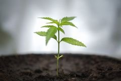
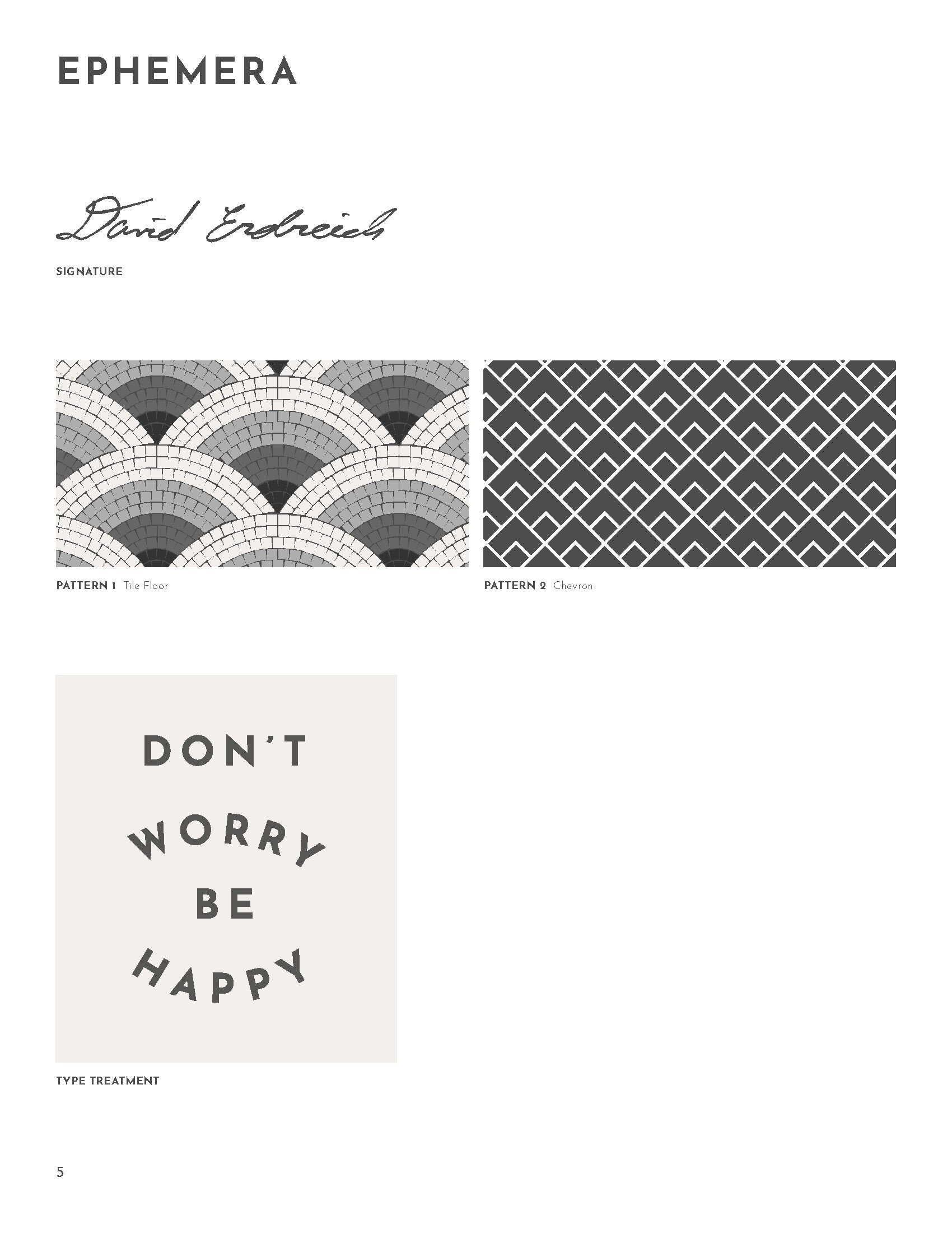
Launching a cannabis startup
Research
Strategy
Innovation
Production
Key result
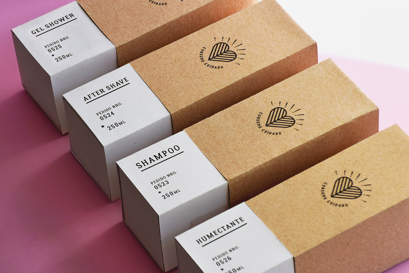
Brand position and visual identity helped startup apply for permits and funding.
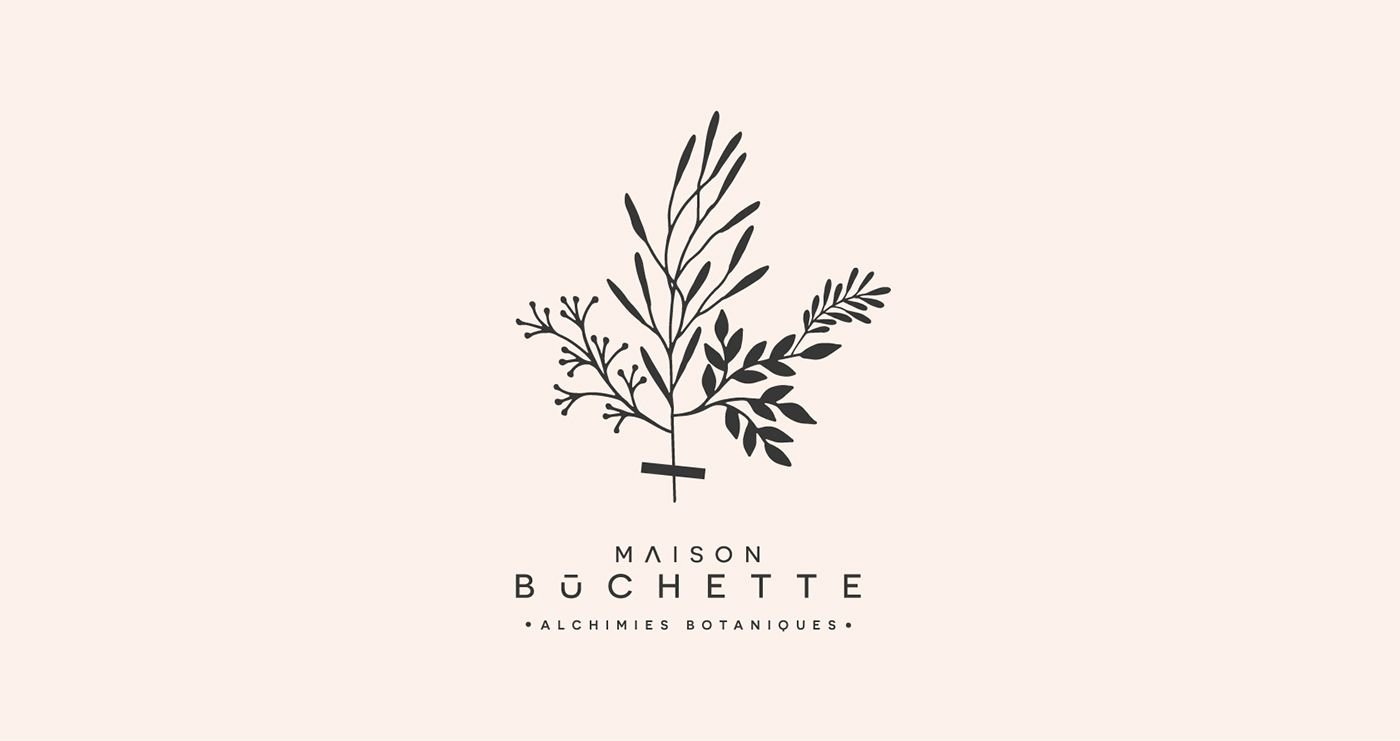
Sona Confections is the brainchild of Boston Consulting Group alum David Erdreich. Working with Creative Director Deb Dutcher, I created a brand identity that captures Sona’s high quality approach to this rapidly-developing space.

Research
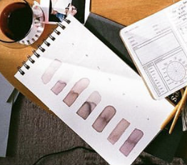
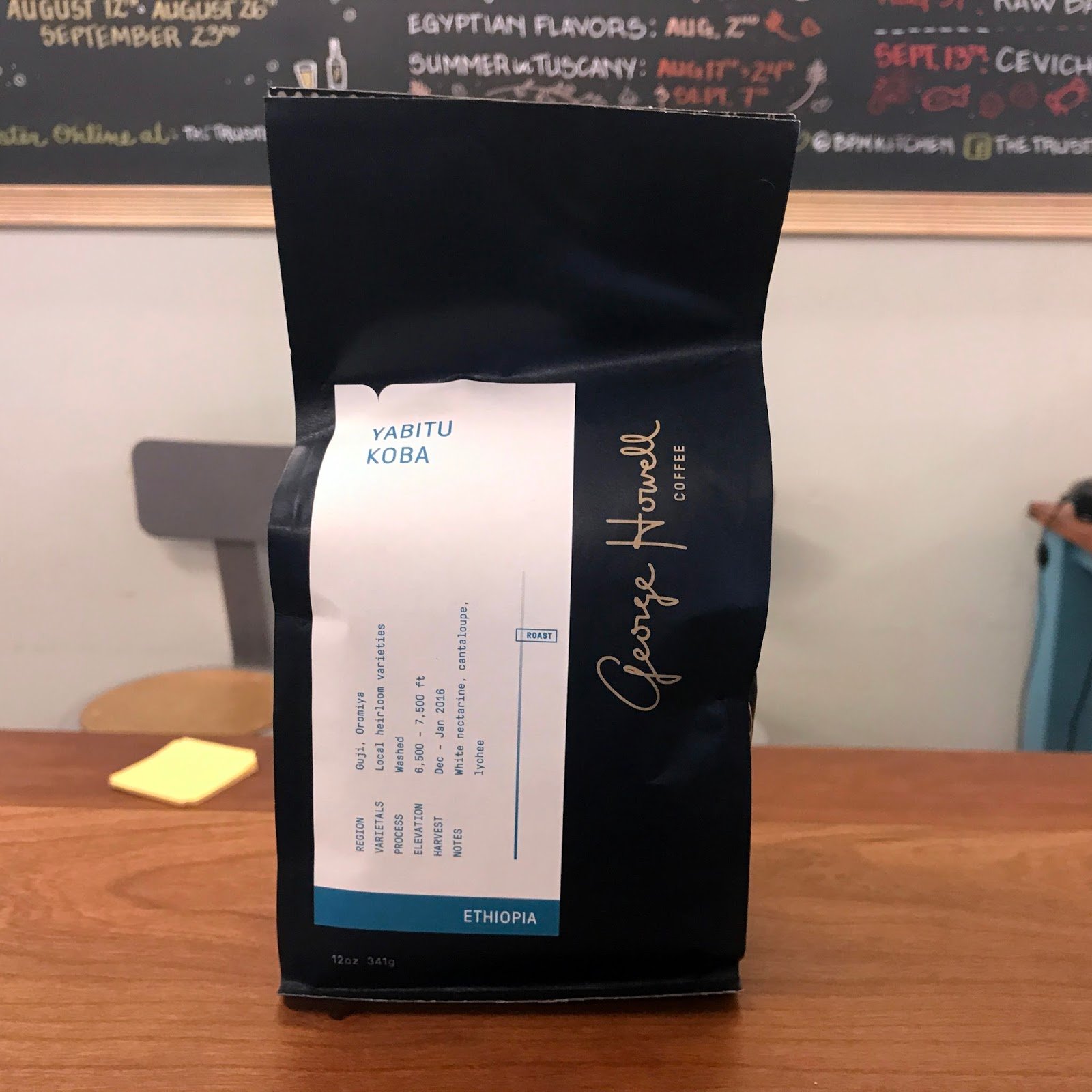
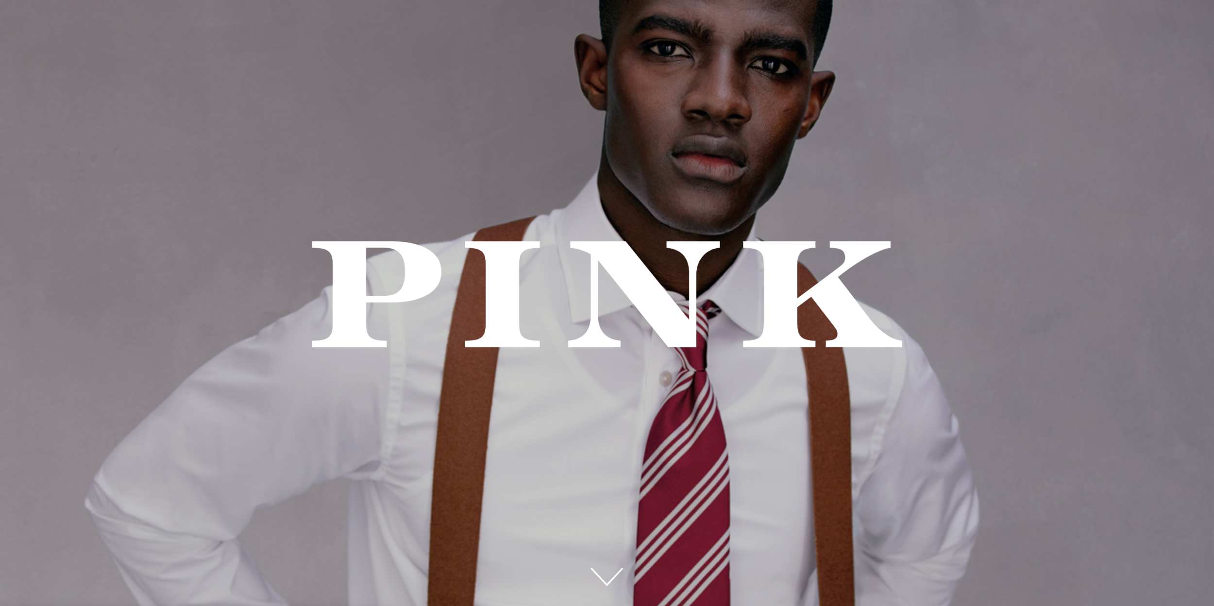
Drawing on the founder's inspiration
The founder, creative director and I gathered a wide range of visual inspiration that helped me generate concepts that matched their expectations.


Strategy
Creative brief and keyword analysis
The creative director and I distilled the client’s goals and audience analysis into a creative brief, and conducted a keyword analysis to help position the brand.


Innovation
Exploring possible identities
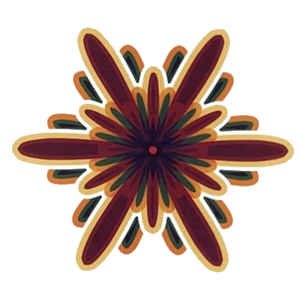
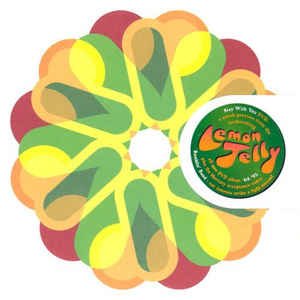
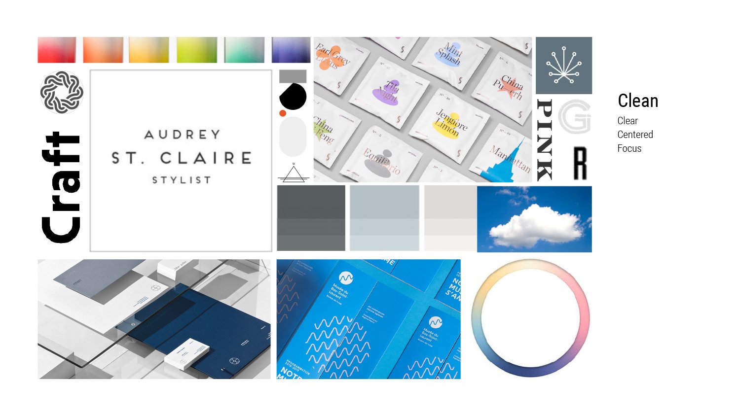
Moodboards
I then categorized our inspiration images according to the brand’s key attributes – clean, warm, and intelligent.


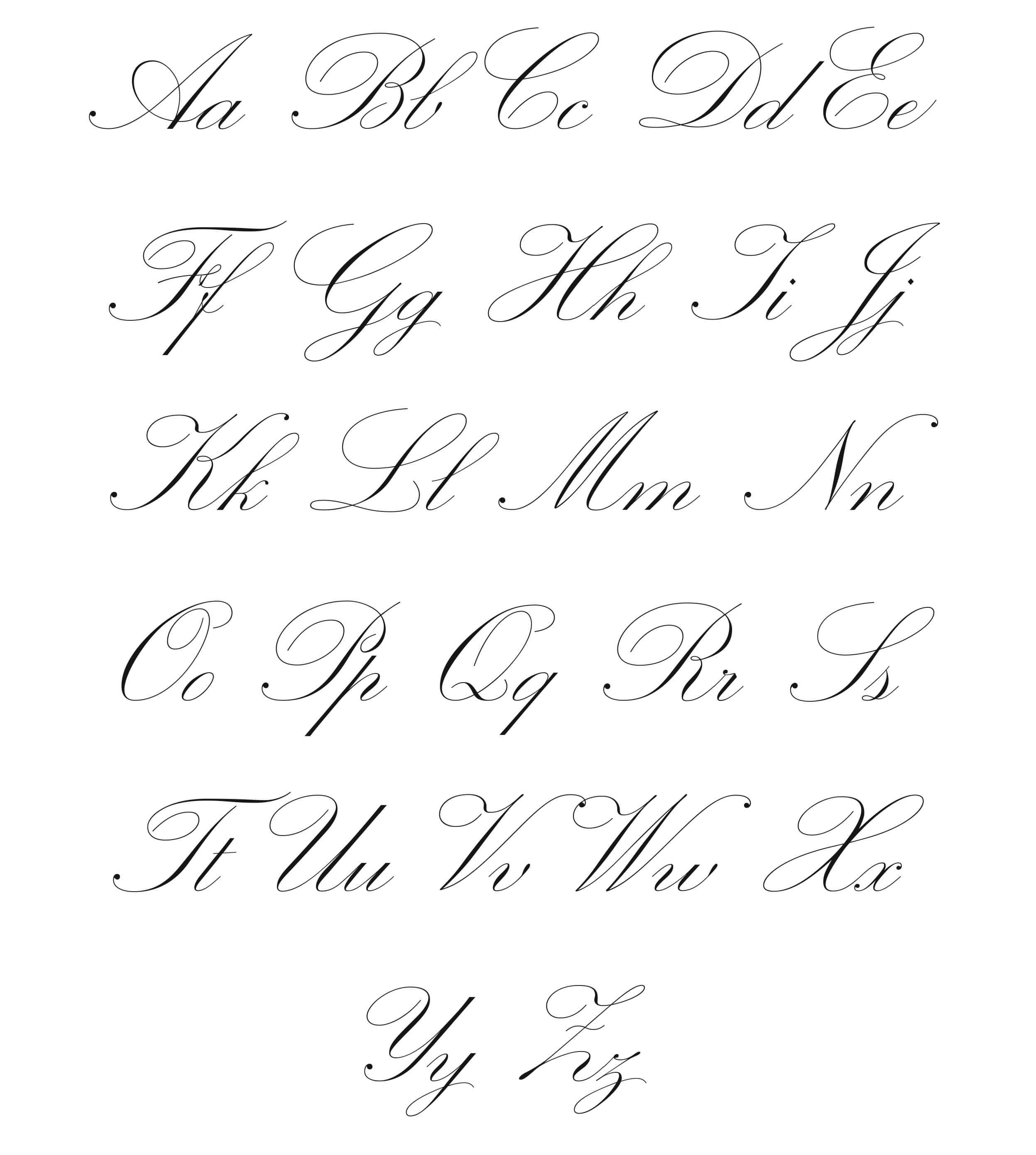
Hand sketches
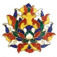
Drawing by hand is the most efficient way to express early ideas. These concepts went unused, but gave the project forward momentum and helped us to see what doesn’t work, which is as important as what does.
Initial concepts


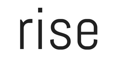
From the sketching, I distilled the most successful ideas into three concepts, which were developed in collaboration with the creative director. These were shared with the client for his feedback – he preferred #2 – and refined.
Refinement
Based on feedback from the client, several modifications of option #2 were explored.

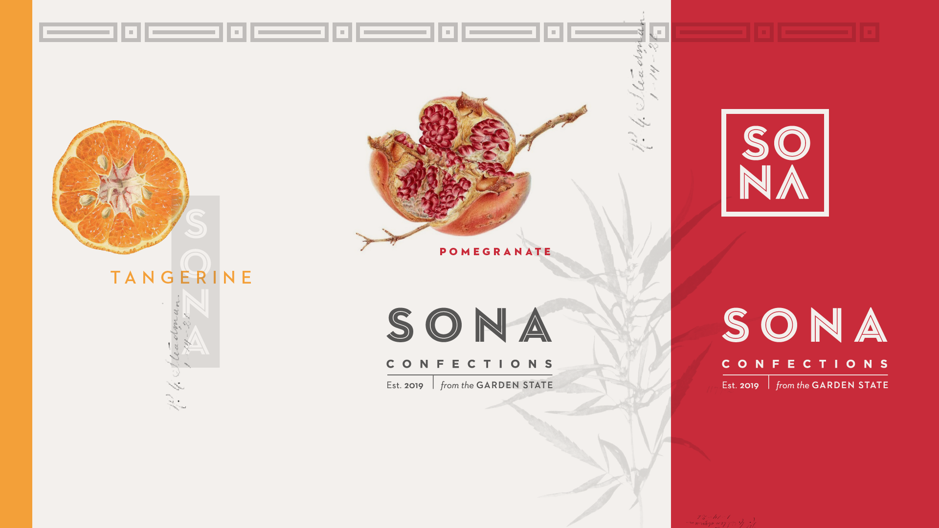


The resulting identity was collected into a look board that could be tested with a small customer audience.

Audience testing
Establishing metrics for success allowed us to take this direction and test it to see if it was resonating with our target audience in the right way. The creative team sent the look board above to eight participants for their impression.

Production
Bringing the business to market
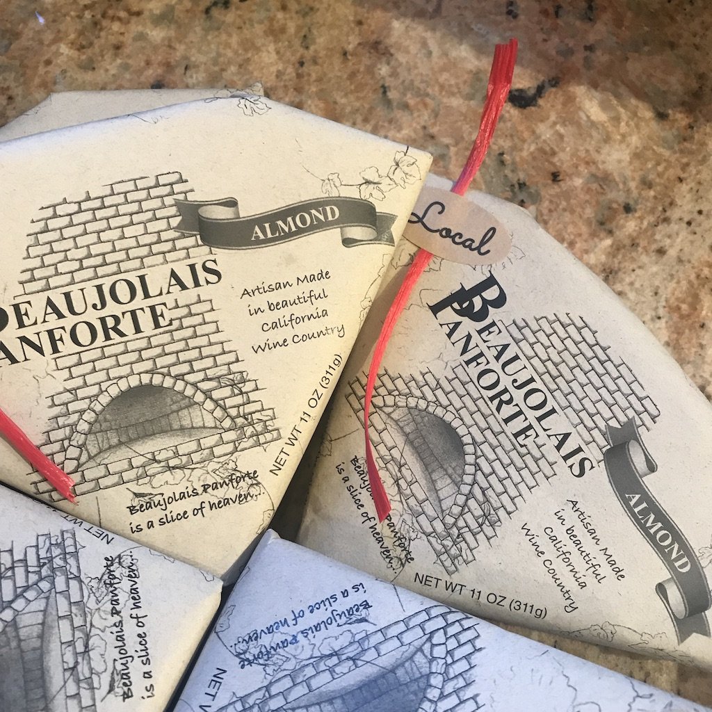
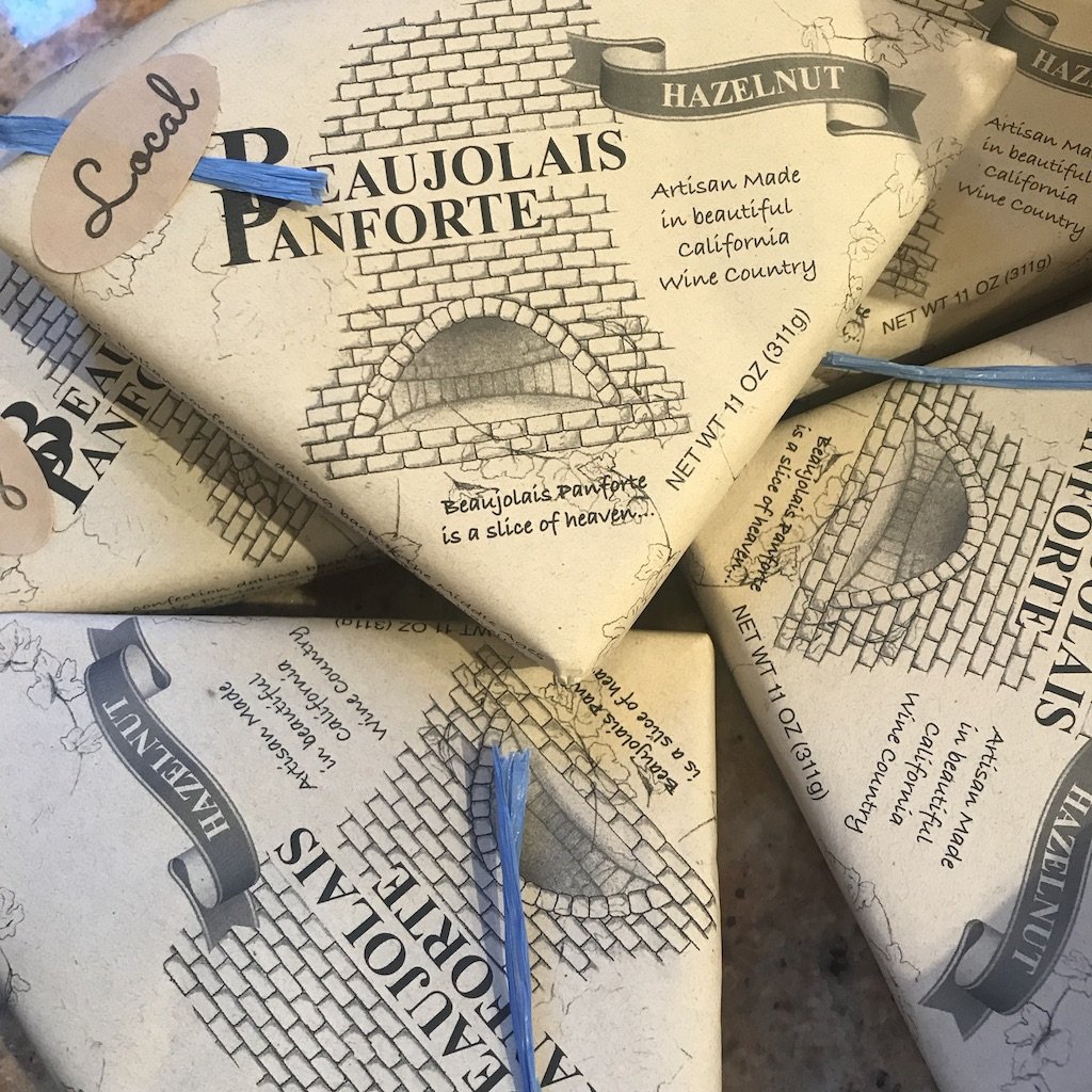
Once the testing result proved that the identity was hitting on the right qualities for Sona’s customer, I pulled out the erroneous elements (some customers felt it looked vaguely Japanese, which wasn't our intent), incorporated final feedback from the client, and produced a guidelines document.
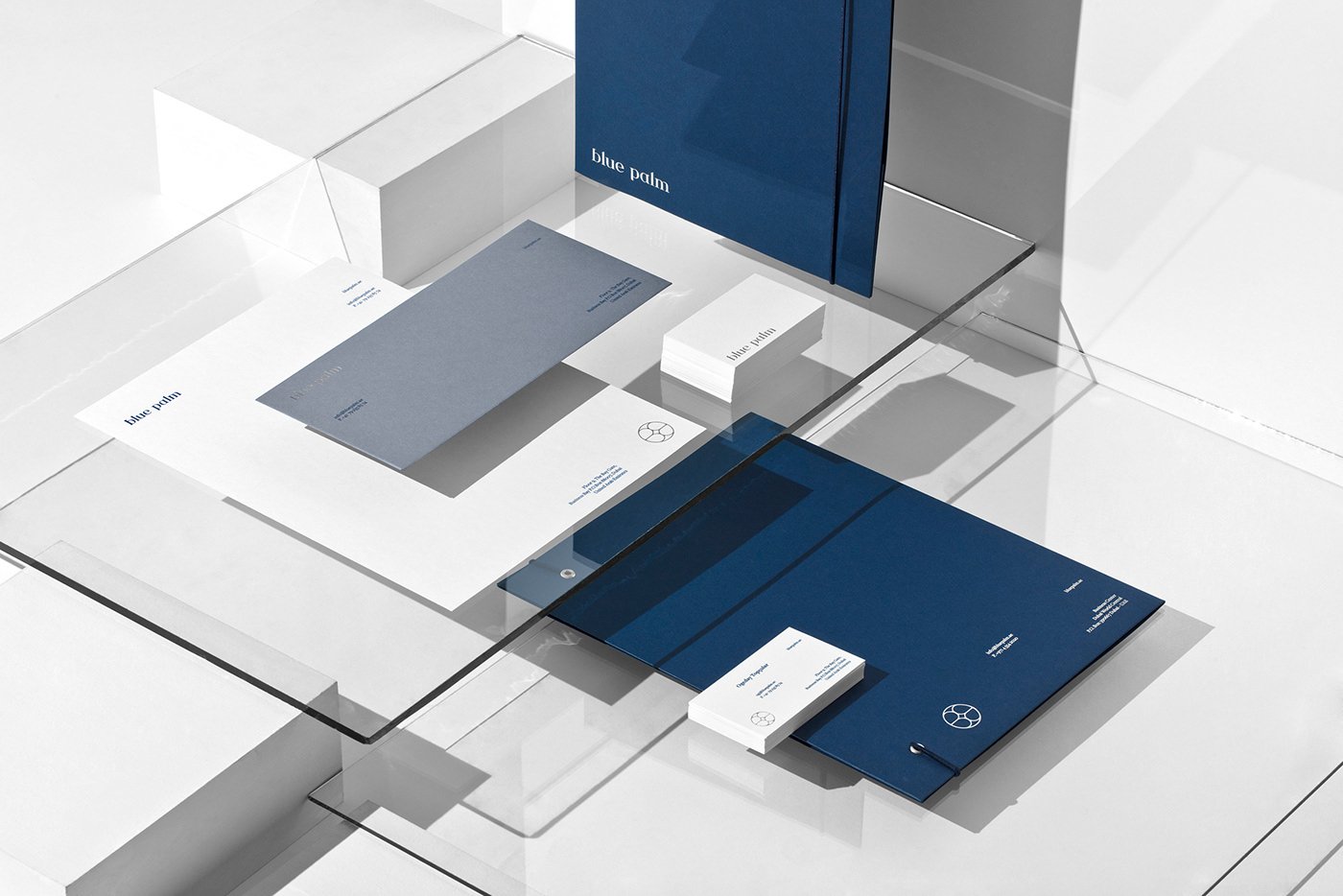
Branding guidelines


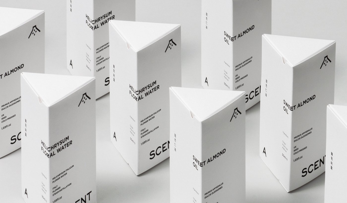
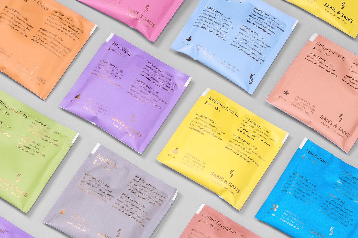
Final artwork and files
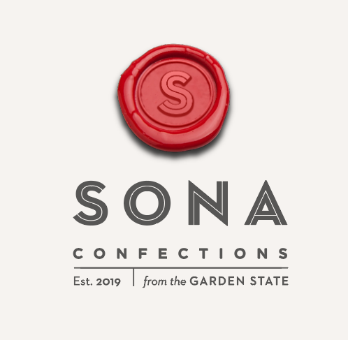
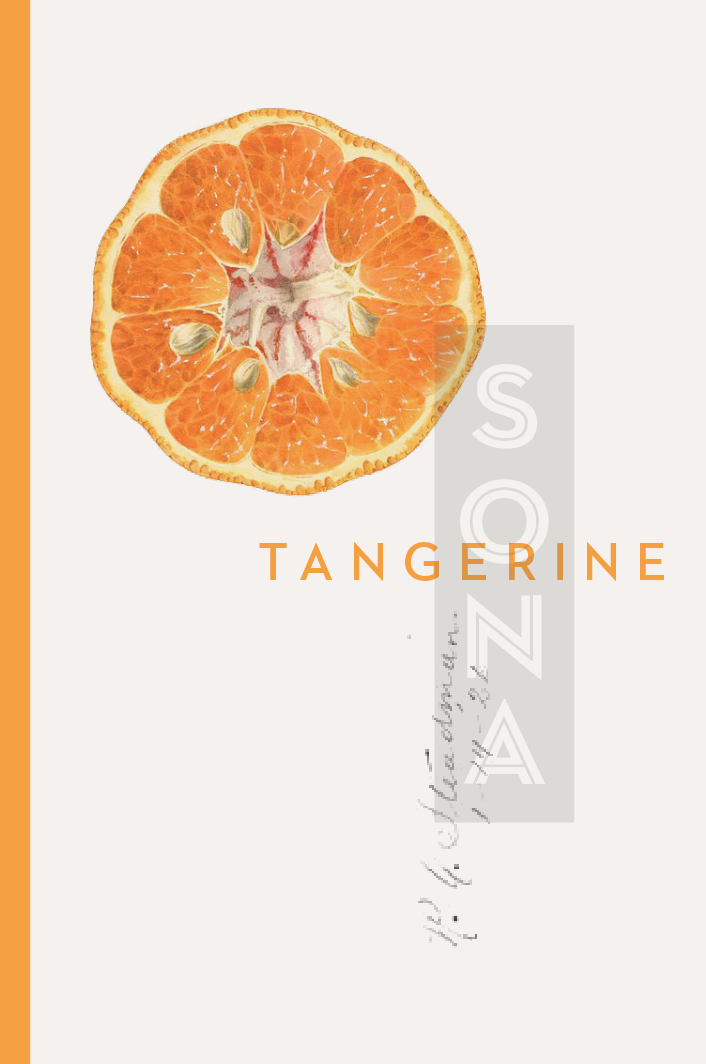
I also finalized the logo and authored Illustrator artwork across a variety of lockups, colorways (black-and-white, color, white-on-black, etc.), and file formats (PNG, JPG, and SVG).

The final artwork Illustrator file